Technology World

welcome to our blog

We are Magcro

Carousel

Posts

Comments

The Team

Blog Journalist

Connect With Us

Join To Connect With Us

Portfolio


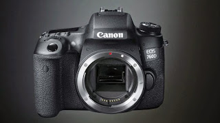
  • The EOS 750D and 760D are Canon's two new DSLRs, and they sit at the top of its beginner's range, ultimately replacing the old EOS 700D, though this model will carry on for the time being.
    So why two cameras and not one? Although they share the same basic specifications, the 750D and 760D are aimed at different kinds of users. The 750D is pitched at relative novices, while the 760D has controls and features aimed at more experienced and more ambitious photographers.

    nside, the Canon 750D (Rebel T6i) and 760D (T6s) are essentially the same camera. Both have Canon's new APS-C format 24.2MP CMOS sensor, a Digic 6 processing engine and the same 19-point autofocus system.
    They both use Canon's new Hybrid CMOS AF III system too, for use when images or video are composed on the screen in Live View mode. Like the 750D, the 760D has Wi-Fi and NFC technology for connecting the camera to a smartphone or tablet for remote control and image sharing.
    Even the continuous shooting speed is the same, at 5fps, and the 750D and 760D have the same metering system and a 3-inch articulating 1,040K-dot touch-screen display.
    On the outside, though, these cameras have some key differences, and the 760D is clearly designed for more advanced photographers, with a number of features taken from Canon's high-end cameras.
    One handy addition in the 760D is an electronic level that can be displayed on the screen on the back of the camera, or in the viewfinder, to help keep horizons straight. This indicates horizontal tilt, but not up/down tilt, so it's useful for getting horizons straight, but it won't help when you're trying to ensure that the sensor is parallel to a building to avoid converging verticals. Like the Canon 7D Mark II, the 760D's viewfinder has a dedicated Level icon and it doesn't use the AF points to display the level – so it can be seen when pressing the shutter release to focus the lens.
    The 760D has a different control layout too, though the two cameras feel very similar in the hand as there's only 0.2mm difference in one dimension between them – the 760D is the slightly taller of the two.
    The 760D also has an eye sensor to detect when the camera is held to your eye to take a shot, and automatically turns off the display on the main screen, whereas on the 750D you have to press a switch.
    One of the biggest differences between the two cameras is that the 760D has a secondary (monochrome) LCD on the top-plate. This shows useful information such as the ISO (sensitivity) setting, battery level, exposure level, shutter speed and aperture. It's useful to see the camera settings from above and uses less power than the main screen.
    On the 760D, the mode dial is on the left of the top plate not the right, and it has a locking button in the centre. This button needs to be pressed before the mode dial can be rotated. It seems rather fiddly at first, but you get used to using it after a while. Nevertheless, it would be better if you could select to lock the dial or not.
    Rather than having a dedicated Wi-Fi indicator on the camera body like the 750D, the 760D displays when the Wi-Fi system is active in the top-plate LCD.
    In another major departure from the 750D, the 760D has a dial around the navigation buttons – along with a lock to deactivate it. This allows quick adjustments to exposure in manual exposure mode and exposure compensation in the automatic and semi-automatic exposure modes because there's no need to press a button while using the main dial.
    The dial feels a little lightweight in comparison with the larger dial found on the back of higher-end cameras. It's also rather low down on the body so it doesn't fall within the natural reach of your thumb, you have to stretch down to it.
    'techradar


  • Leica M Monochrom Typ 246 - Riview

    Unlike the sensors inside the vast majority of digital cameras, the sensor inside Leica's Monochrom doesn't have a 'traditional' RGGB Bayer pattern filter. This means that it can't produce colour images, only black and white – hence the camera's name. It also means that each photosite on the sensor is used to create a pixel in the image without any interpolation. The end result is black and white images that have much more detail and dynamic range than images shot on a standard camera whether you shoot in colour and convert a raw file, or shoot black and white JPEGs.
    The original Leica Monochrome was capable of producing superb quality images, but its handling was rather awkward and some of its specification decidedly old-hat, especially for a camera with such a huge price tag. Judging by the specification of the new version (Typ 246) and the few minutes I was able to spend shooting with it, Leica has taken significant steps to correct these issues.
    Whereas the original Monochrom used an 18Mp full-frame CCD sensor from Kodak, the new version has a 24Mp full-frame CMOS sensor from a Belgium-based company. Leica claims that this brings much greater dynamic range than the previous model – and noise control should be improved despite the hike in pixel count.
    The sensor is combined with the new Leica Maestro processor and together they enable a sensitivity range of ISO 320-25,000. The previous version topped out at ISO 10,000, and this indicates the confidence that Leica has in the new camera's noise control. If the 1/4000sec maximum shutter speed won't allow you to use wide apertures when you need to you'll have to use an ND or coloured filter to cut out some light as the Type 246 doesn't offer the ISO 160 'Pull" sensitivity that the original did.
    Other significant changes include a 100% increase in buffer size (up to 2GB) to speed image processing, the addition of Live View mode complete with focus peaking (with red, green or blue highlights) and the ability to shoot full-HD video. There's even an optional electronic viewfinder to give a Live View image.
    One issue with the original Monochrom was the low quality of its 2.5-inch screen. Thankfully this has now been upgraded to a 3-inch 921,600-dot Sapphire glass unit with an anti-reflective coating.

    Build and handling

    You have a certain expectation about the build quality of Leica M cameras and the Monochrom Typ 246 doesn't disappoint. It feels incredibly solid and well-crafted. Its splash-proof metal body is designed to last a lifetime. However, while it feels well-made, it isn't especially comfortable to hold, having a combination of flat surfaces and strong edges. That said, I found it was reasonably secure in my hand, but given its cost I doubt many photographers would risk using it without a strap.
    The Monochrom Typ-246 is based upon the M-P Typ 240, which means that is has the same minimalist control layout, but there are a few handling improvements on the older Monochrom. For a start, the exposure compensation is easier to access, instead of being buried in the menu until being assigned to the rear dial, it is now accessed by pressing and holding a button on the front of the camera while rotating the rear dial. This button and dial combination is also used to access the focus assist magnification in Live View mode. I thought it might be easy to mix these two up and make the wrong adjustment, but actually I found I got the right option every time. I'll look at this a bit more when we perform our full test.
    The exposure controls are traditional, which means that shutter speed is set via the shutter speed dial with an 'A' for automatic setting, and aperture is set by the lens ring. Sensitivity, however, is set via the menu.


    Being an M camera focusing is entirely manual. When using the viewfinder, which seems more natural with an M, you rely on aligning two images at the centre of screen in the usual rangefinder way. This takes a bit of getting used to if you're unfamiliar with this technque, but it doesn't usually take long before most people are focusing quite quickly.
    If you use the Monochrom's Live View mode you'll be able to see the image as it will be captured, in black and white and with the appropriate framing instead of relying on the bright lines of the viewfinder. You can also use focus peaking to guide focusing. In the short time that I had with the camera, I had mixed success with this. In some instances the bright red lines were very clear, but in others less so. I'll investigate this more when we get a sample in for testing.

    Leica M Monochrom Type 246 sample imageThis picture shows the beautiful shallow depth of field effect of the full frame sensor, and that the focusing system can be very accurate.
    As with the previous model, the viewfinder displays very little information, if the exposure is incorrect, for example, you only see the direction in which it should be adjusted, not the degree of adjustment that's required. When you shoot in aperture priority mode, however, you see the shutter speed that the camera is using.
    I shot with the Monochrom for a few moments on a bright sunny day and although the screen suffered a little from reflections, it fared pretty well. I used the Live View a few times purely to test it, and it worked well, but as I said earlier, the viewfinder seems a more natural choice when shooting stills.


    Performance

    Naturally we will reserve final judgement until we get a sample for full testing, but on the basis of what we know about the original camera's capabilities and the sample shots that I've seen from the new model, I think it's safe to say that the Monochrom is a great camera if you are a dedicated black and white photographer.

    Leica M Monochrom Type 246 sample image
    The Leica rangefinder design is the classic tool for traditional 'street' photography.
    Noise appears to be controlled well and is fine-grained in images captured at ISO 12,500. Their dynamic range is also high.
    As before, the camera appears to prefer quite dark, moody images, but the majority of users are likely to want to use the camera as a data gathering device and adjust the DNG raw files to get the best result possible.
    It will be interesting to see how many people are interested in shooting black and white video.

    Verdict

    Leica's reputation is such that there are many people who have a lifelong ambition to own a Leica camera. I'm not one of those people. I like traditional controls, but I like modern niceties like autofocus, an ergonomic shape and smattering of customisation options as well as quick access to key features. The Monochrom Typ 246 is a little awkward to hold, has a focusing system that many would consider outdated and a limited number of features and controls. I shouldn't like the Monchrom, but I do. In fact I think I love it. Given its huge price I'm hoping that I fall out of love with it when it comes in for testing.
    'techradar
  • The Huawei P8 is the Chinese firm's latest foray into the flagship market, and it's arguably its best handset to date after the comparably sedate Ascend P6 and Ascend P7 of the past couple of years.
    The "Ascend" name has been dropped in favour of the cleaner Huawei P8 moniker, which tidies up its previously messy naming regime.
    In terms of price you're looking at €499 (around £395, $580, AU$760) for the 16GB model, or €599 (around £465, $680, AU$900) for 64GB of internal space, making the Huawei P8 comfortably cheaper than the current fleet of 2015 flagships.
    There's a 5.2-inch full HD display up front, while the metal unibody design comes in at just 6.4mm thick - making the Huawei P8 thinner than the iPhone 6 and Samsung Galaxy S6.
    Picking up the P8 I found it to be well weighted, manageable in one hand and indeed it does look and feel premium.
    The slightly curved, chamfered edges provide a little extra grip, although the completely flat rear and super slim 6.4mm profile means it's not the most comfortable to hold. It does however, slip effortlessly in a pocket.
    Huawei made a point of saying how solid the aluminium unibody is on the P8, and while there's no obvious cause for concern in terms of bend-ability I look forward to seeing others applying more pressure to see if it goes the same way as the iPhone 6 Plus.
    While the Huawei P8 does sport a premium metal body, it doesn't quite match the same style and grace of the iPhone 6 or HTC One M9.
    The all metal unibody just doesn't look or feel quite as premium as its rivals - whether it's the finish Huawei has chosen to apply or use of cheaper materials, it's not clear.
    It feels like there's something still missing to really push it into the design stratosphere, but it's another positive step forward and the Huawei P8 is still a premium device.

    The metal power lock key is situated about half way down the right of the P8, in a slightly recessed dip making it easier to find when you run a finger along the edge.
    The volume rocker sits above it, while below are two trays - one for your 4G nanoSIM and one for a microSD card (up to 128GB in size) which also doubles as a second nanoSIM port.
    There are both single and dual SIM variants of the Huawei P8, so the handset you get may not have the clever second SIM functionality in the microSD bay.
    You can pick the Huawei P8 up in four colours; mystic champagne, carbon black, titanium grey and prestige gold. The champagne and grey only feature on the 16GB model while black and gold are reserved for 64GB.

    Something for you eyes

    The full HD display may not match the 2K Galaxy S6 and LG G3 in terms of resolution, but with the Sony Xperia Z3 and HTC One M9 both sporting full HD panels it's not really being left behind by the QHD crowd.
    That means it has a pixel density of 424ppi - matching the One M9, although the Xperia Z3 wins here thanks to its smaller 5-inch screen giving you 441ppi.
    It's bright, colourful and responsive making everything look clear and easy to read, and bezels have been kept to a relative minimum apart from the area of dead space below the screen.
    You'd expect to see a physical home key or some touch navigation keys here, but Huawei doesn't deal in home buttons and it's moved navigation on screen leaving a bar of blank space.
    This isn't unique to the P8 - plenty of handsets have additional space on the front - but it's surprising Huawei hasn't seen fit to even stick its logo here.
    At 5.2 inches it's on the cusp between manageable and slightly too big for one handed use, so if you have smaller palms it may be a little tricky to reach all areas of the screen.
    It doesn't break any ground, but it doesn't need to, and the display on the Huawei P8 provides a strong level of performance, allowing you to enjoy the on-screen experience.
    'techradar


Latest Post

  • Canon 760D (Rebel T6s) - Riview
  • Leica M Monochrom Typ 246
  • Huawei P8 review
  • Comments

    The Visitors says